2025 Jun - Present ( 6 months )
Lead Product Designer (myself), Product Designer Intern, Software Engineer, Product Manager
Figma, Figjam
Product Designer responsible for research, wireframe, prototype and design systems.
UX research, persona synthesis, workflow redesign, new IA, component system, cross-functional alignment
Shuk Rentals is a fast-growing rental management platform with over 2M+ payments processed, built by landlords for landlords. I led the end-to-end redesign of its mobile and web experience, rearchitecting the financial workflows, improving property and lease management, and establishing the foundation for a scalable design system.
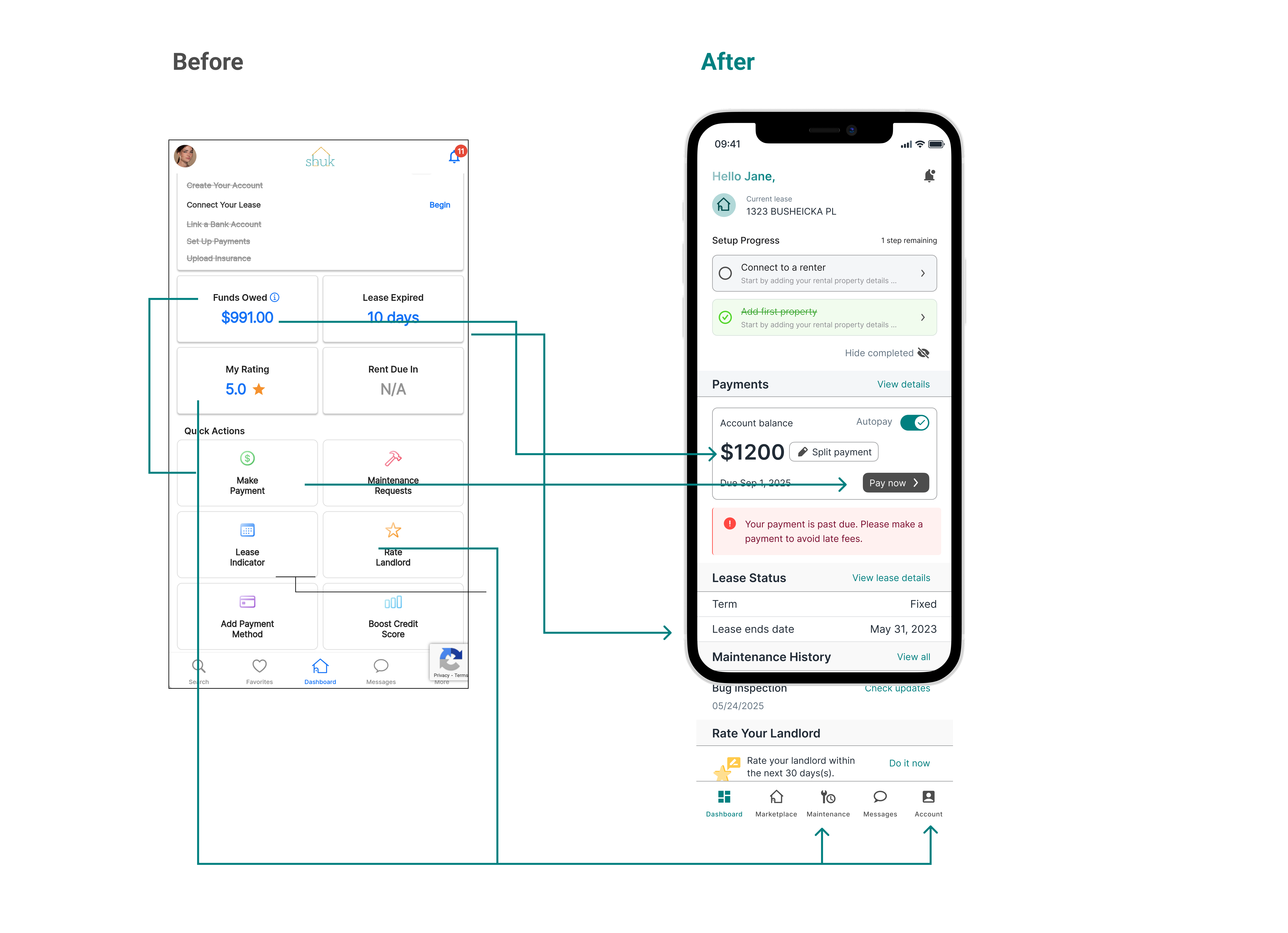
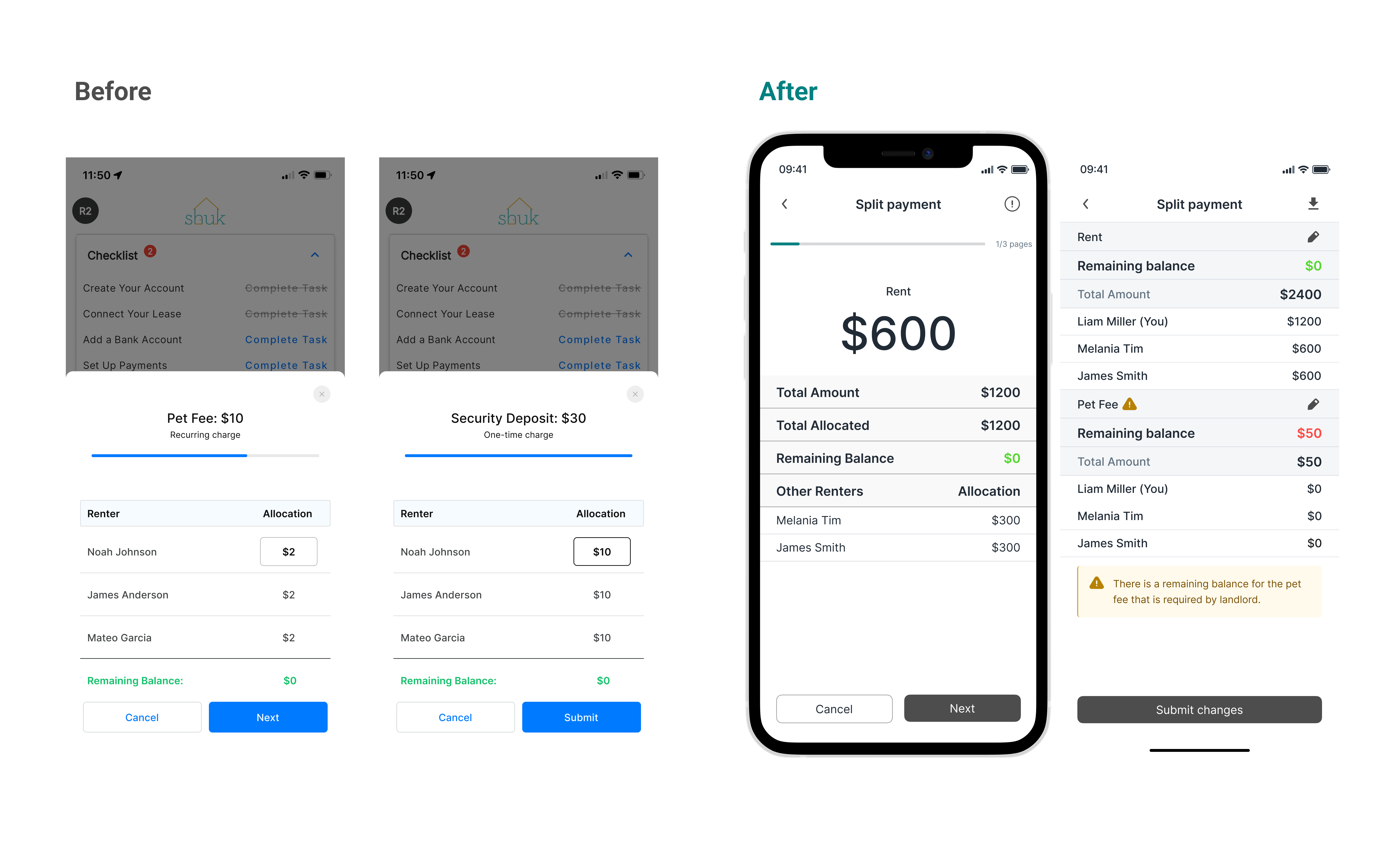
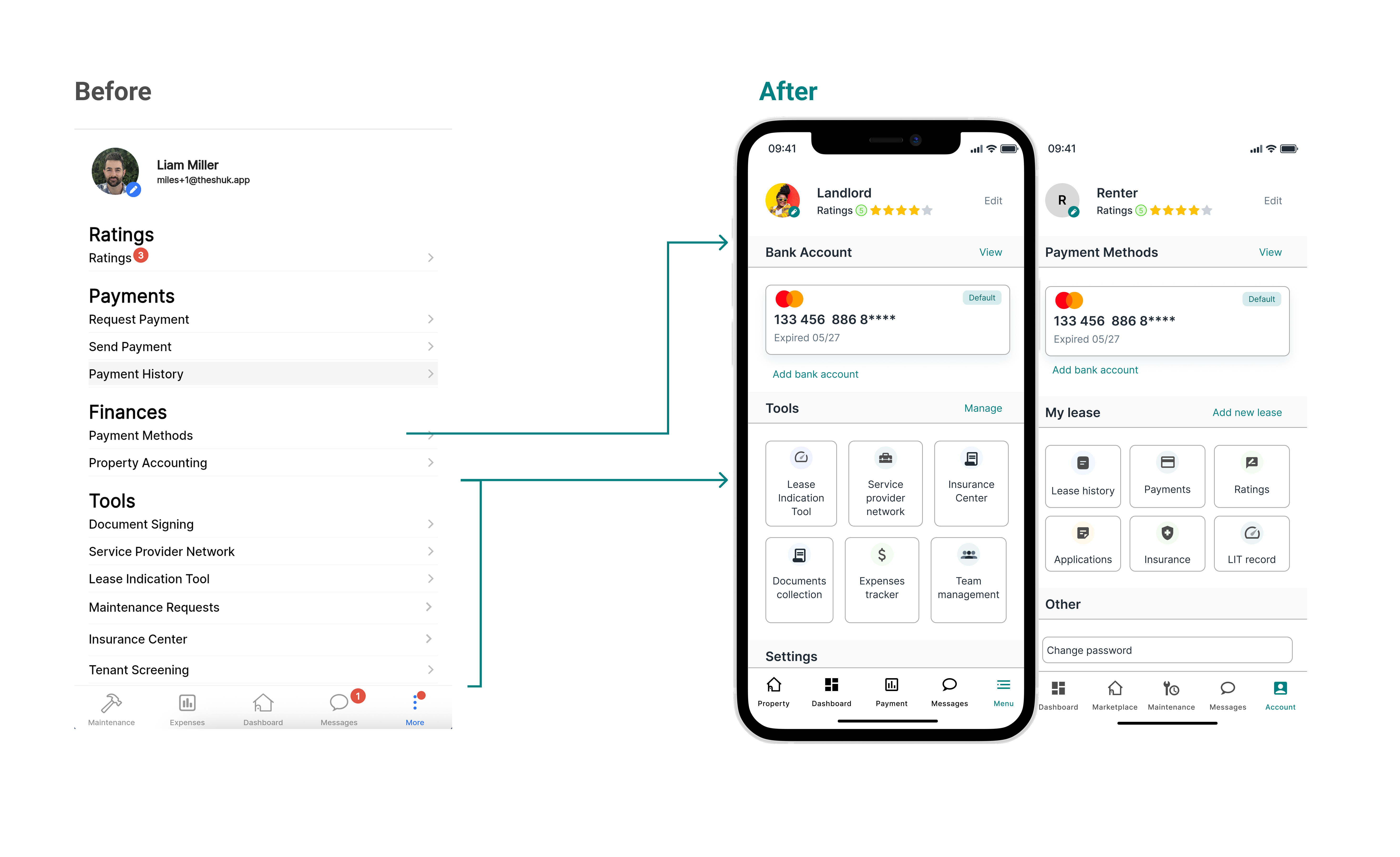
This case study focuses on redesigning the financial workflows for renters and landlords. The previous system was fragmented, reactive, and difficult to navigate, especially during high-stakes tasks like submitting payments, tracking balances, and managing payouts.
Through mixed-methods research, experience mapping, and iterative prototyping, I redefined the core financial experience into a cohesive, predictable, and trustworthy workflow.
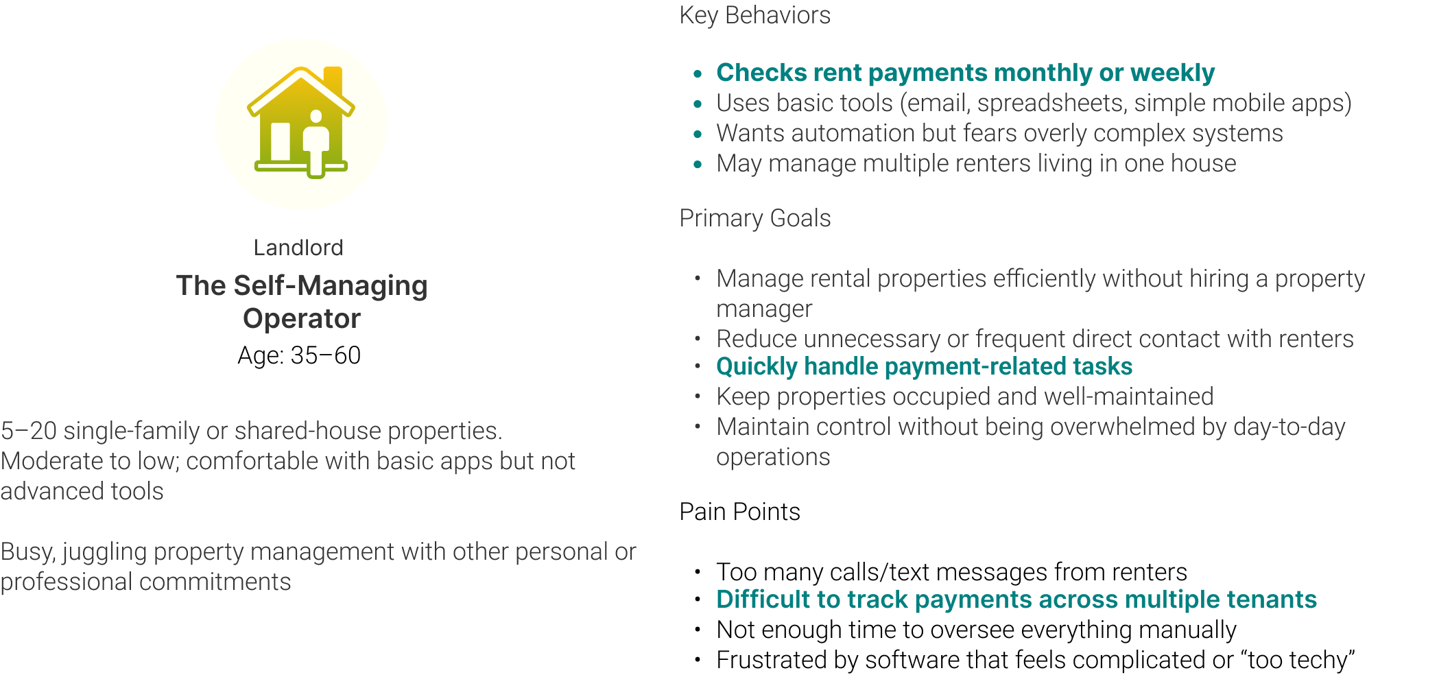
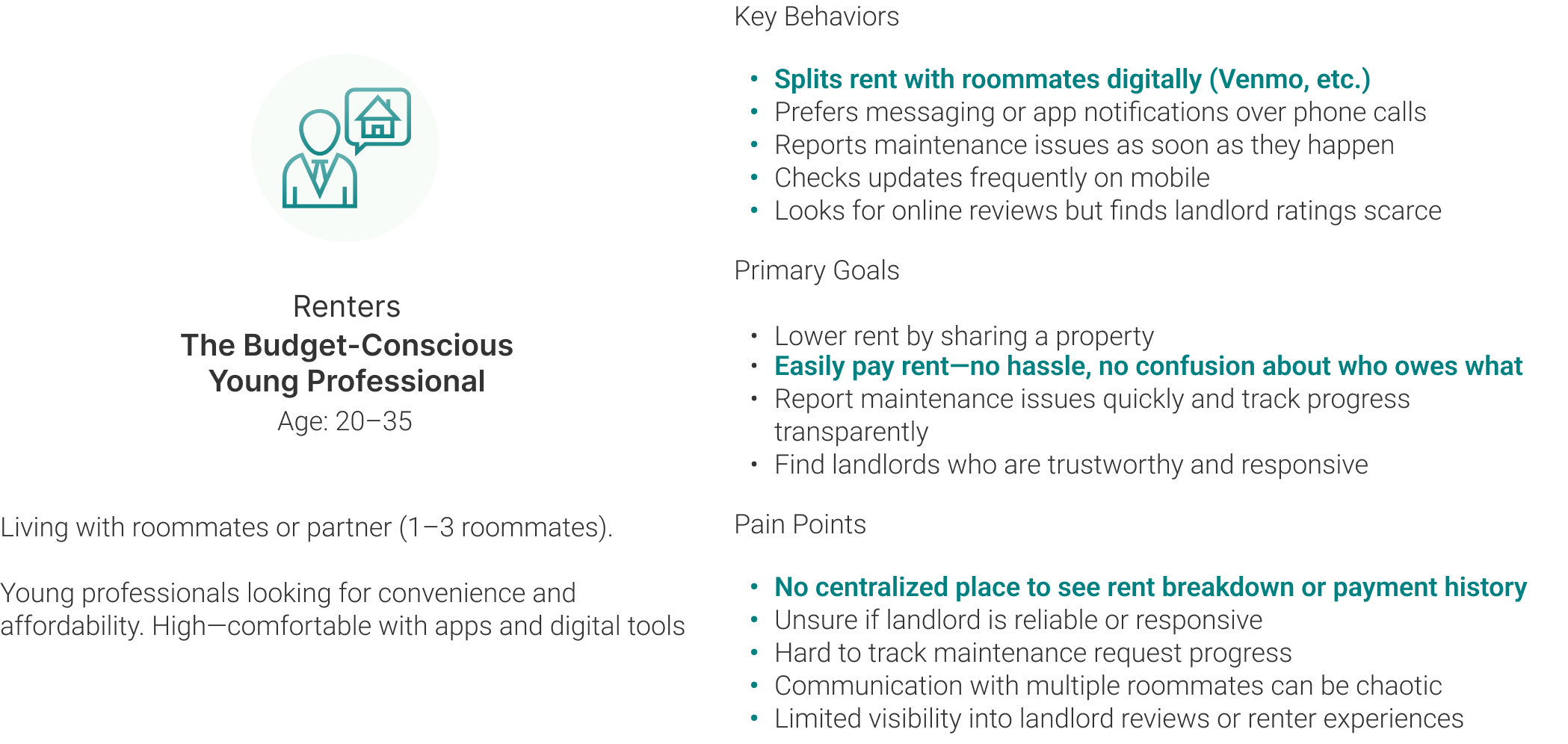
When I joined, Shuk Rentals was growing quickly but its experience felt disconnected, with features built in isolation over time. To ground the team in a shared understanding, I led a full-site audit that examined every workflow from onboarding to payments. This revealed clear patterns in how people used the platform, allowing me to define two primary personas that guided the redesign:
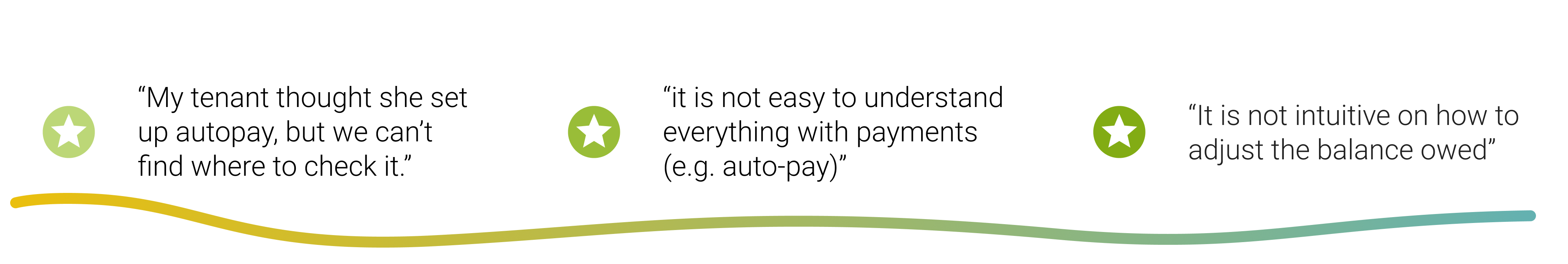
For a product where trust and financial clarity are central, the experience was unintentionally creating friction, uncertainty, and unnecessary communication between tenants and landlords. As I moved through the audit, patterns began to surface, revealing where users felt confused, where workflows broke down, and where important information was either hidden or inconsistent. The key issues I uncovered included:
With these insights, I met with the PM and cofounder to walk through the key friction points. As we reviewed the workflows, they immediately recognized the issues as recurring themes in user complaints. This confirmed that the problems I identified aligned with long-standing feedback from both tenants and landlords:
This alignment turned the audit into the foundation for redefining the product’s financial architecture, giving the redesign clear strategic direction.
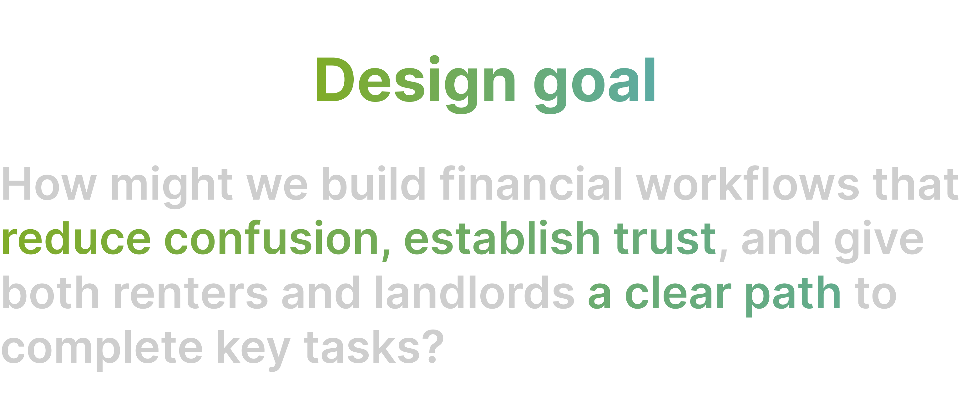
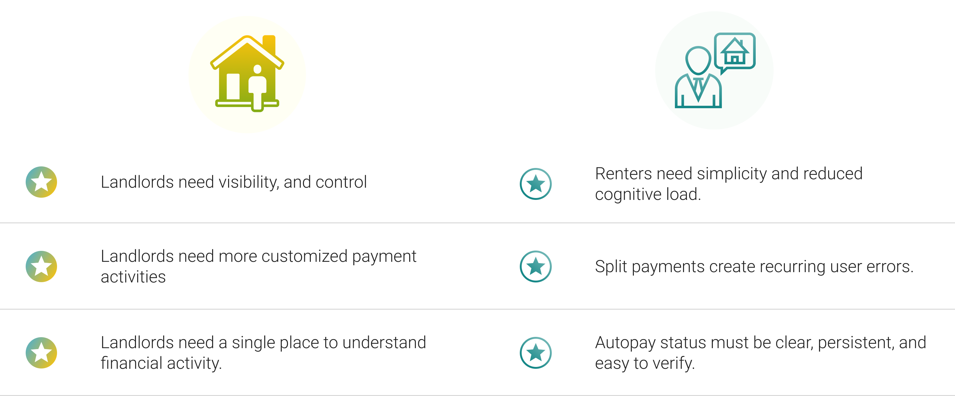
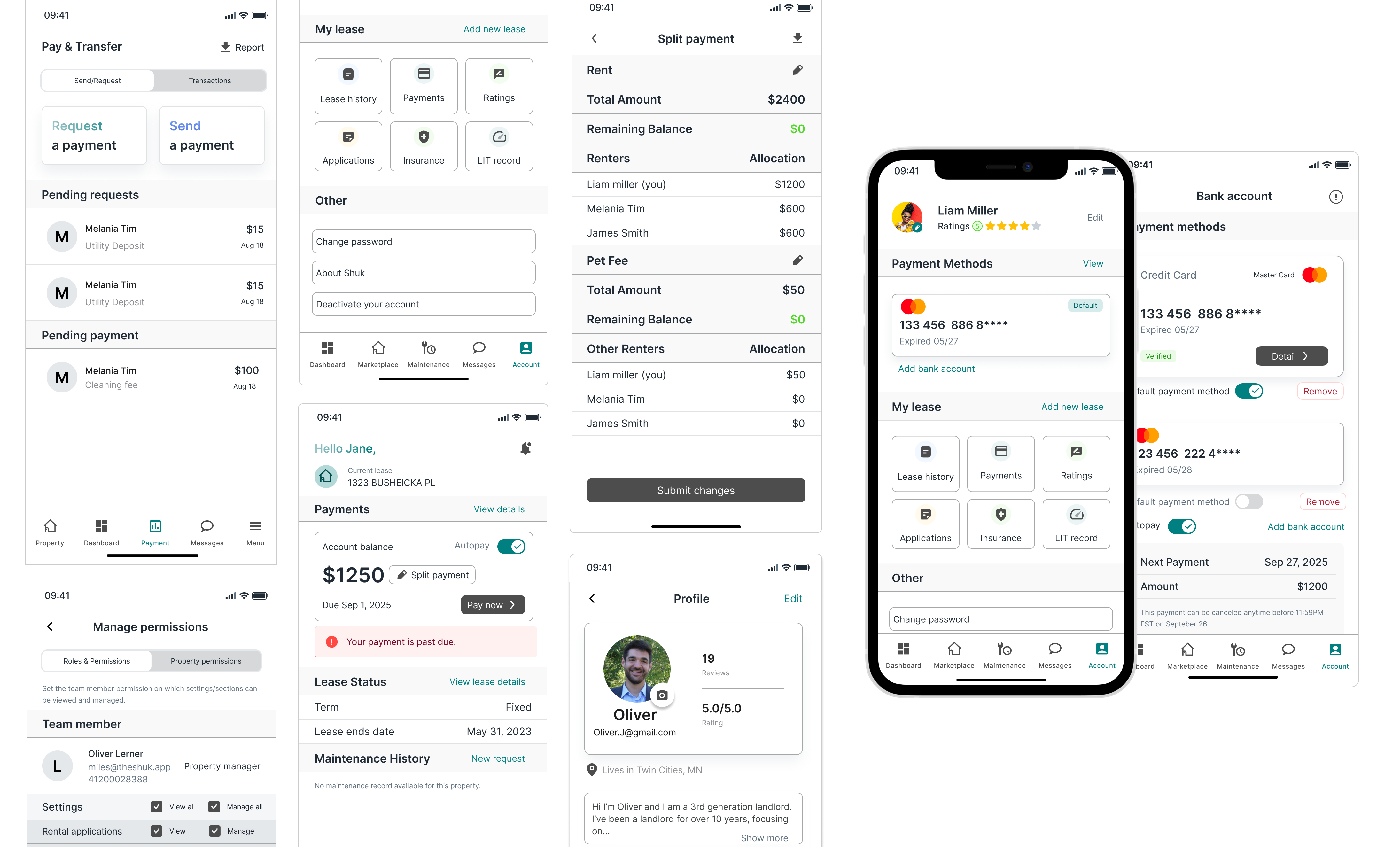
Because renters and landlords engage with payments in fundamentally different ways, I tailored each experience to match their priorities. Landlords focus on monitoring and managing payments, whereas renters value clarity and a simple, frictionless way to pay.
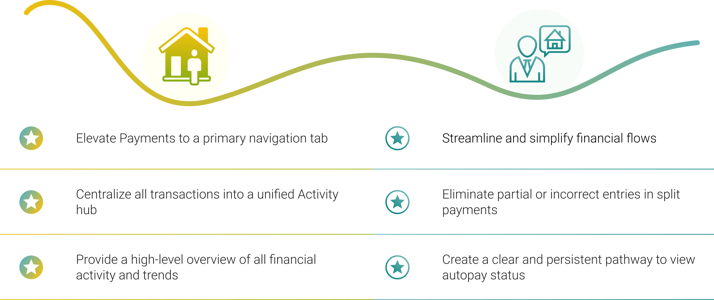
Renters can now turn on/off autopay whether from dashboard or via bank account.
A redesigned split payment flow prevents incorrect allocations, provides real-time validation, and reduces mistakes.
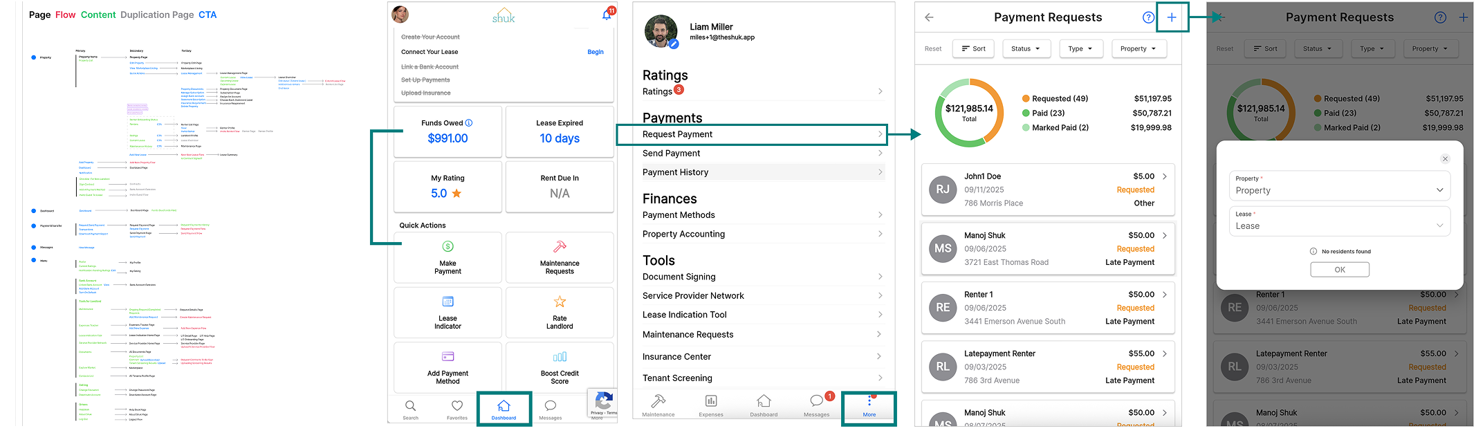
This streamlined payment flows covers main renter payments activities including pay required payment, and send money to landlord.
I delivered a comprehensive design handoff that included all edge cases custom UI states, conditional screen logic, and variations in card design, ensuring engineering had everything needed to build accurately without ambiguity.
This project reinforced the importance of designing financial workflows around the distinct mental models of renters and landlords. Their needs weren’t just different—they required separate structures to support clarity, control, and trust.
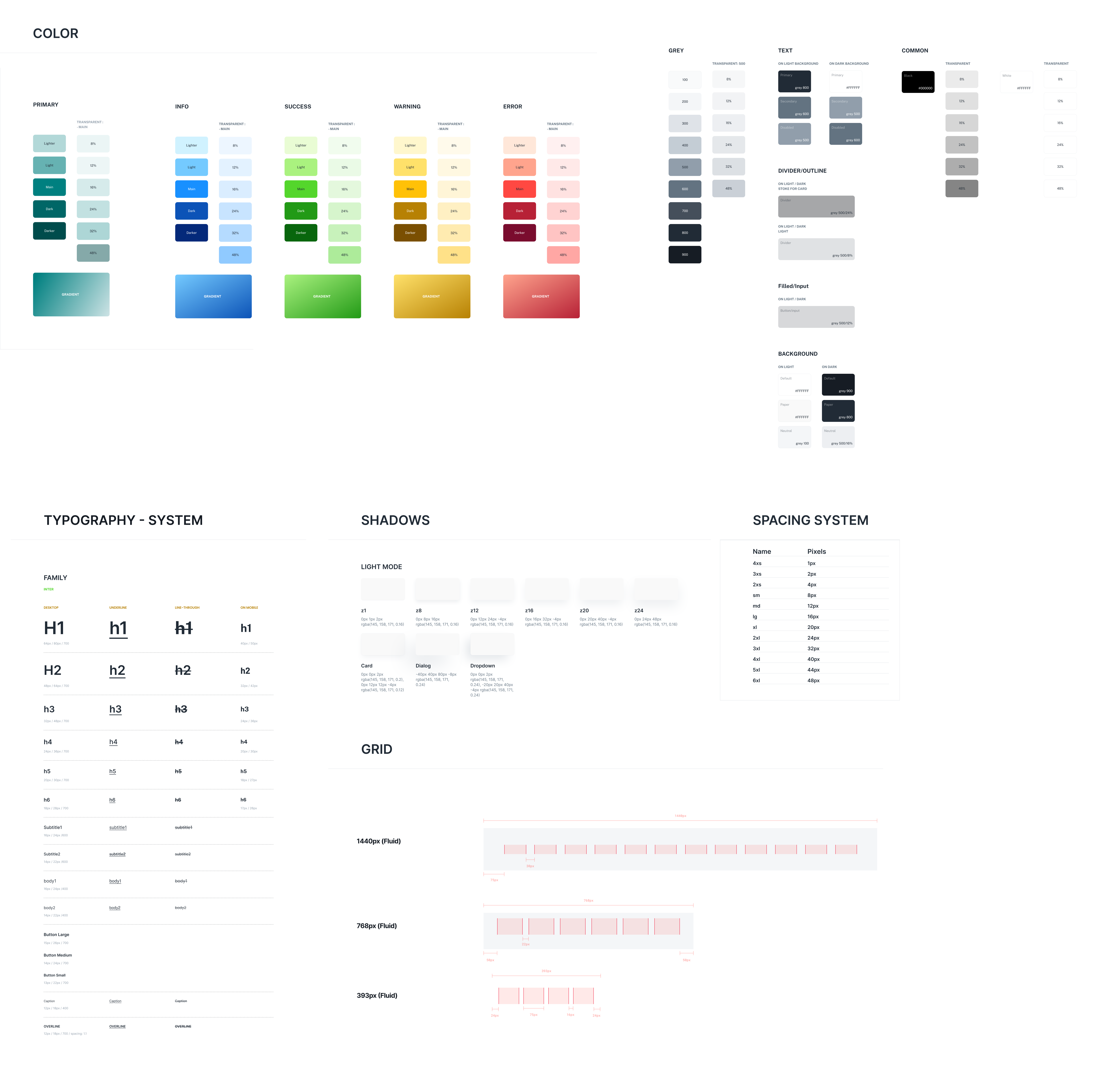
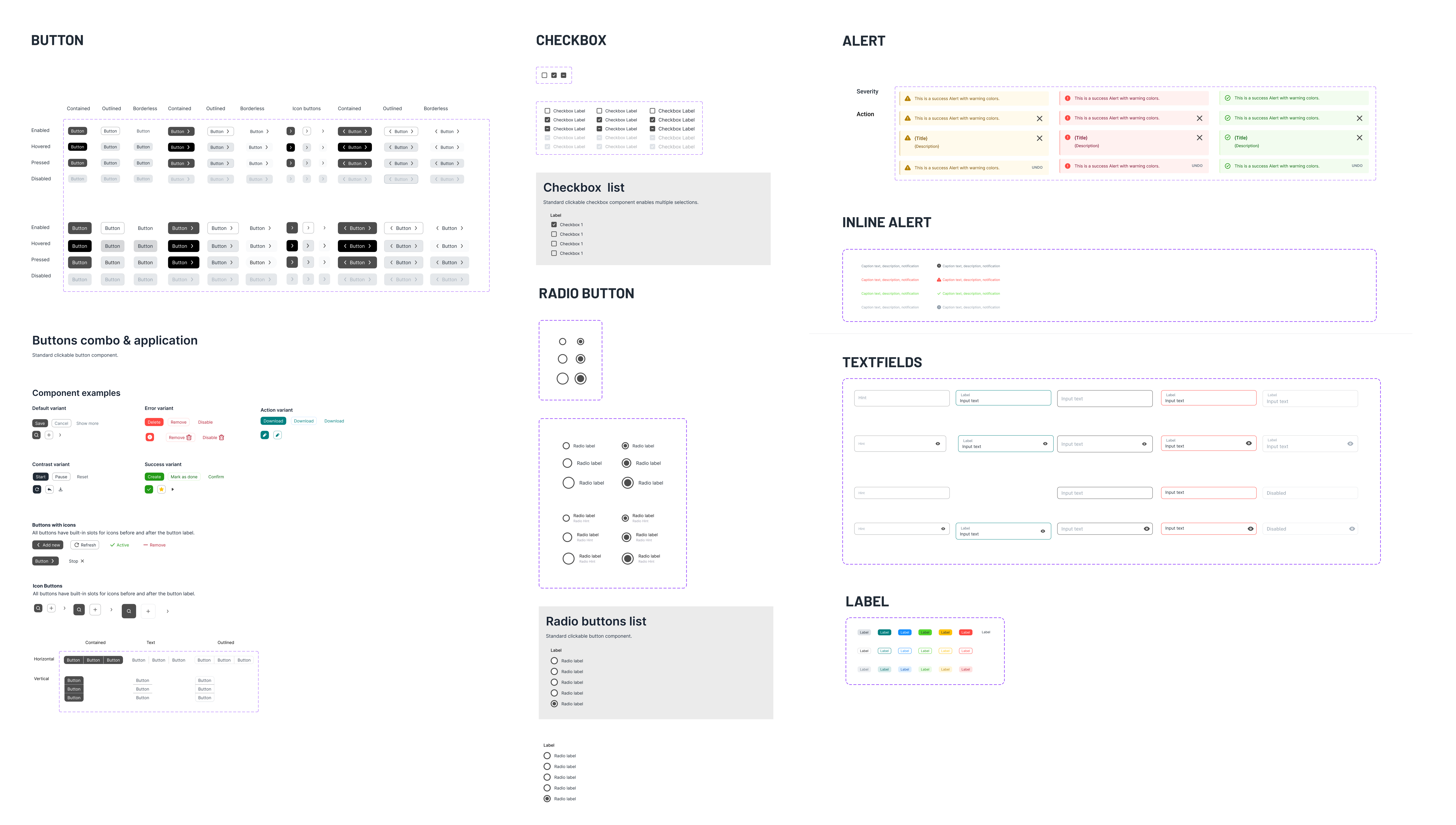
While building the product in Figma, I also reflected on the importance of structuring pages with component-based systems. This approach made it easier to manage changes across layers and supported faster, more consistent iteration.
From Founder & CEO of Shuk Rentals
"I had the pleasure of working with Kathy on our design system project at Shuk, and I can't recommend her highly enough.
Over the past few months, she took on the challenge of re-designing our mobile and web platforms and the results exceeded our expectations. Kathy built us a complete Figma-based design system following atomic design principles, with thorough documentation and components that work seamlessly across both our app and web platforms.
What stood out most about Kathy was her ability to grasp the bigger picture of what we're building. She took the time to deeply understand our different user types and what matters most to each of them. This kind of user-centric thinking informed her entire approach to our information architecture.
Beyond her technical skills, Kathy was a joy to collaborate with. Professional, responsive, and always thinking one step ahead. Any team would be lucky to have her."


A Product Designer
based in Washington DC-Baltimore Area

