
A decision aid mobile design for new mom with cystic fibrosis with The Converge Center for Innovative Research on Gender Health Equity.
2023 March - April ( 4 weeks )
Kathy Xiaotong Yu
Elizabeth (Lizzie) Sokolich
Figma, Figjam, Procreate, Notion
User research, wireframing, prototyping, user testing, interface design, illustration
The Converge Center for Innovative Research on GenderHealth Equity, is a university-based research center. We were challenged to develop a simple mobile tool to help people with cystic fibrosis (CF) make informed and values-concordant decisions related to breastfeeding. Collaborating closely with the researchers, we designed a tool that received positive feedback for its clarity and usefulness.
My ability to collaborate with peer designers across all phases of design, from research and concept development to wireframing and prototyping.

Moving can often seem like a continuous stream of stressful events. From the repetitive process of reserving a truck to the challenges of modifying bookings, coordinating with moving assistants, and handling a large truck, do-it-yourself movers using U-Haul can find the moving experience both disjointed and frustrating.
This all-in-one virtual assistant redefines the entire moving journey. It offers responsive voice-guided features that optimize tasks, enhance coordination, and provide real-time alerts and guidance. It's particularly adept at intelligently addressing complex requests, which is a valuable asset for movers under pressure. By doing so, it significantly boosts the efficiency and overall enjoyment of the moving process while simultaneously alleviating driving concerns through hands-free, real-time support.

What is cystic fibrosis ?
Making decisions about breastfeeding is a highly personal choice that involves considering a multitude of factors, particularly for women with CF (cystic fibrosis). There are no definitive right or wrong answers when it comes to such matters.

What is people’s mental framework when making ‘difficult’ decisions with multiple options whose features are valued differently?
According to Ottawa Decision Support Framework, people have multiple decisional needs including Unclear values, inadequate acknowledge, inadequate resource, personal needs, and clinical needs. There lead to two types of decisional outcome: Informed and value-based.

What are the factors might influence decisions about breastfeeding / formula feeding / both?
We categorized the factors and picked 3 primary factors: Disease management, Medications, Nutrition and BMI, secondary factors: Return to work, Sleep Cost and shortage of formula, Cultural ideas related to the benefits of breastfeeding and stigma associated with formula, feeding PTSD, trauma, cultural, or other factors contributing to breastfeeding aversion. In this project, we focued on prototype on the first three main factors as examples and develop a templates that can be expanded to other secondary factors.


Navigate preference-sensitive decisions is hard
Making decisions about breastfeeding is a highly personal choice that involves considering a multitude of factors, particularly for women with CF (cystic fibrosis). There are no definitive right or wrong answers when it comes to such matters.
Gap to communicate effectively and openly between patients and doctors
Even physicians struggle to offer effective advice on breastfeeding. All participants expressed that their doctors failed to provide adequate information to assist them in making decisions when seeking guidance.
Unclear reproductive health goals, values and preferences
Many patients lack a clear vision of their own thoughts on feeding options or change preferences over time.
High risk for poor reproductive outcomes
The decisions regarding feeding options for women with CF have serious consequences for many factors, including their own disease control and the health of babies, etc.

Knowledge
Provide a comprehensive view of the factors users need to consider along with trustworthy information

Values
Encourage users to reflect on their personal preferences and current circumstances

Support
Facilitate communication between users and their physicians and support system
✔️ Trustworthy
✔️ Reassuring
✔️ Soothing
✔️Informational
Example:
“Many parents want to breastfeed their baby. Breastfeeding has many positive outcomes, for you and for your baby. However, not everyone can or wants to breastfeed, and that’s also fine. What’s most important is that your baby is getting the nutrition they need.”
Example:
“Many parents want to breastfeed their baby. Breastfeeding has many positive outcomes, for you and for your baby. However, not everyone can or wants to breastfeed, and that’s also fine. What’s most important is that your baby is getting the nutrition they need.”“Medications that were safe for you to take during pregnancy are not always safe for breastfeeding and vice versa, so partnering with your care team to closely assess your current list of medications is key.”
Understand that people have limited mental load for information, especially educational information. Comparing to create an exploratory structure to let users explore topics and information freely, we decided to Utilizes a blend of linear and exploratory frameworks to furnish users with extensive information while simultaneously preserving flexibility.

To find a solution to ensure that the information provided is digestible for individuals. We iterated several ways to design the topic session. After outlining all the relevant information under each topic, we decided to follow a fixed structure of intro, topics including information and user input, and journal entry.

Engaging in conversations with doctors and significant others about personal sensitive topics can pose challenges. To address this, during our brainstorming session on facilitating these discussions during the decision-making process, we introduced two essential tools: the Journal and Report. These tools empower users to gather their thoughts, relevant topics, and information, enhancing their ability to communicate effectively with the important stakeholders involved.

Following evaluation research protocol, we tested the mid-fidelity prototype with two target users and ask the participant to think out loud as they walk through the screens in sequence. From their feedback, we can understand what people might be looking for in an app of this nature.

The ability to save selected information with a simple click was positively received, and the generated report proves to be valuable during care appointments. The information's segmented structure facilitates easy exporting when needed.
During different stages, users may utilize the app at various points in time, such as immediately after finding out about their pregnancy, right before giving birth, and during the first three months after giving birth. In the latter scenarios, mothers will likely want to use the app while multitasking to accommodate their busy schedules.
It is important to be mindful of the language and tone of voice used, as they can significantly influence people's perspectives on certain topics.
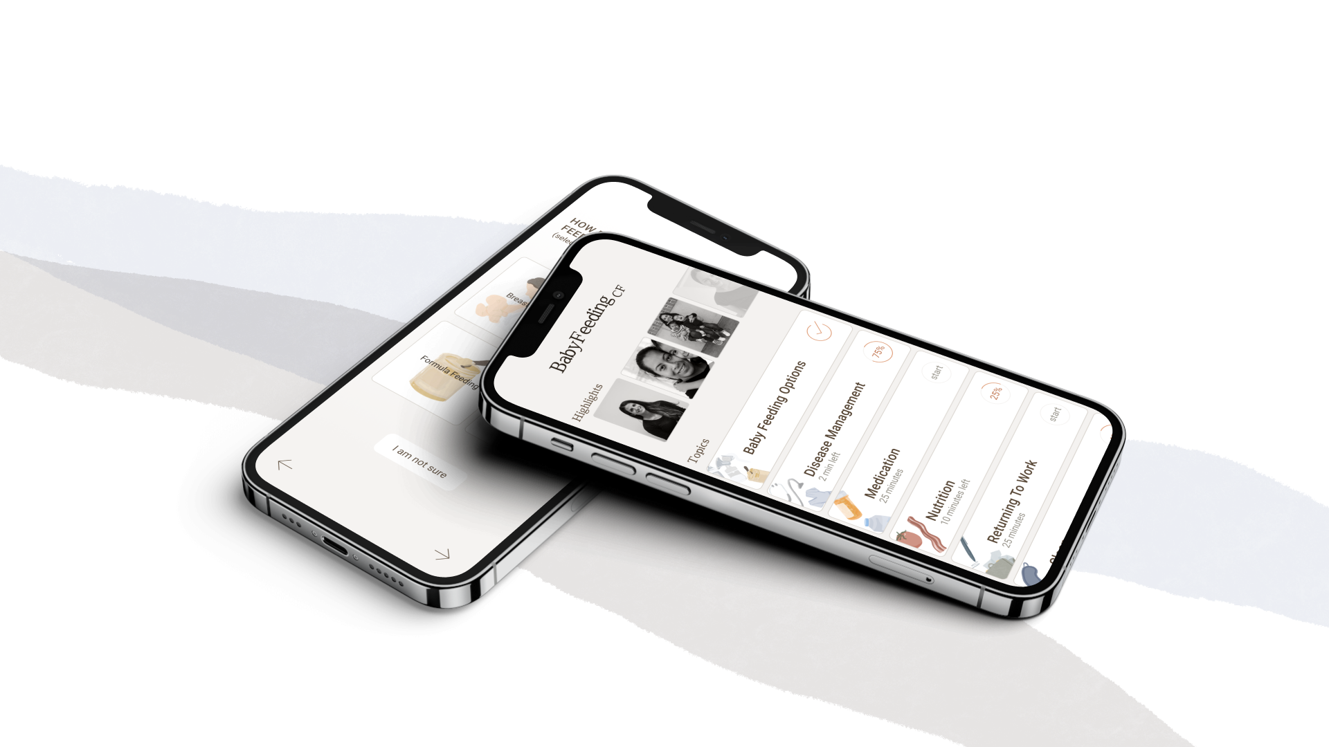
Reassuring, empathetic, and soothing language to create a non-judgmental tone. Upon completing the Onboarding and Tutorial, users are presented with an extensive list of topics to choose from based on their interests. By selecting a pre-determined topic, users are provided with a starting point to begin exploring and expanding their knowledge. Additionally, clear language on the page indicates that users can return to this selection at any time. Topics are listed in alphabetical order for consistency and to avoid placing unintentional value.


At the end of Onboarding and Tutorial, users select topics they are interested in from an extensive list. Stories (approved by internal team) that share the decision-making process or new research. They can be browsed using a convenient horizontal scrolling feature, which allows for easy swiping between stories. Topic card includes a progress bar, percent complete and approximatively reading time for each topic. Topics that have been completed show a checkmark.
The progress bar shows the status of the completion of a topic and the steps that remain. If the question is saved, all segments below will be automatically selected and saved. Each page follows a structure that begins with a question, followed by segment of relevant information, responses, graphics or data below it.


Voice entry allow users to multi-task and capture their thoughts while doing other activities such as holding babies, in a therapy session. Voice entry is also more natural way to people to capture their ideas. User can access to report while browsing topics from the floating icon from navigation.


The warm and neutral color tones evoke a sense of calm and soothing, while also promoting a feeling of trustworthiness. Additionally, high contrast color palettes increase readability.

Using a serif font can add a sense of refinement and formality to the text. Additionally, the body text font was intentionally selected to ensure readability and legibility.

The illustration concept incorporates a textured brush to add depth and a natural look. Additionally, light transparency is used to emphasize the overlapping of shapes, representing the various factors that converge to make a decision.

Icons that were used throughout the app.

Start with Simple questionnaire that employs reassuring, empathetic, and soothing language to create a non-judgmental tone, give users flexibility and control over their experience and allows them to quickly and easily access the app.
An onboarding tutorial provides a seamless and straightforward introduction to the key features and tools of the product, with the goal of familiarizing users with them by inviting them to practice with examples.

Upon completing the Onboarding and Tutorial, users are presented with an extensive list of topics to choose from based on their interests. By selecting a pre-determined topic, users are provided with a starting point to begin exploring and expanding their knowledge.

Users will follow a linear process, browsing through a wide range of factors that the topic covers. This structure begins with a question, followed by segments of relevant information, responses, graphics, or data below it.

The report page gathers all the saved topics, questions, and relevant information, and Journal entries, making it readily available for viewing and exporting as needed.


A Product Designer
based in Washington DC-Baltimore Area


