
Moving can often seem like a continuous stream of stressful events. From the repetitive process of reserving a truck to the challenges of modifying bookings, coordinating with moving assistants, and handling a large truck, do-it-yourself movers using U-Haul can find the moving experience both disjointed and frustrating.
This all-in-one virtual assistant redefines the entire moving journey. It offers responsive voice-guided features that optimize tasks, enhance coordination, and provide real-time alerts and guidance. It's particularly adept at intelligently addressing complex requests, which is a valuable asset for movers under pressure. By doing so, it significantly boosts the efficiency and overall enjoyment of the moving process while simultaneously alleviating driving concerns through hands-free, real-time support.


2024 Oct - 2025 Jun
Product designer(myself), Fas Lebbie, Engineer team
Figma, Figjam
Founding product designer responsible for information architecture, interactive data dashboard, shopping and checkout flows, cross-platform design systems.
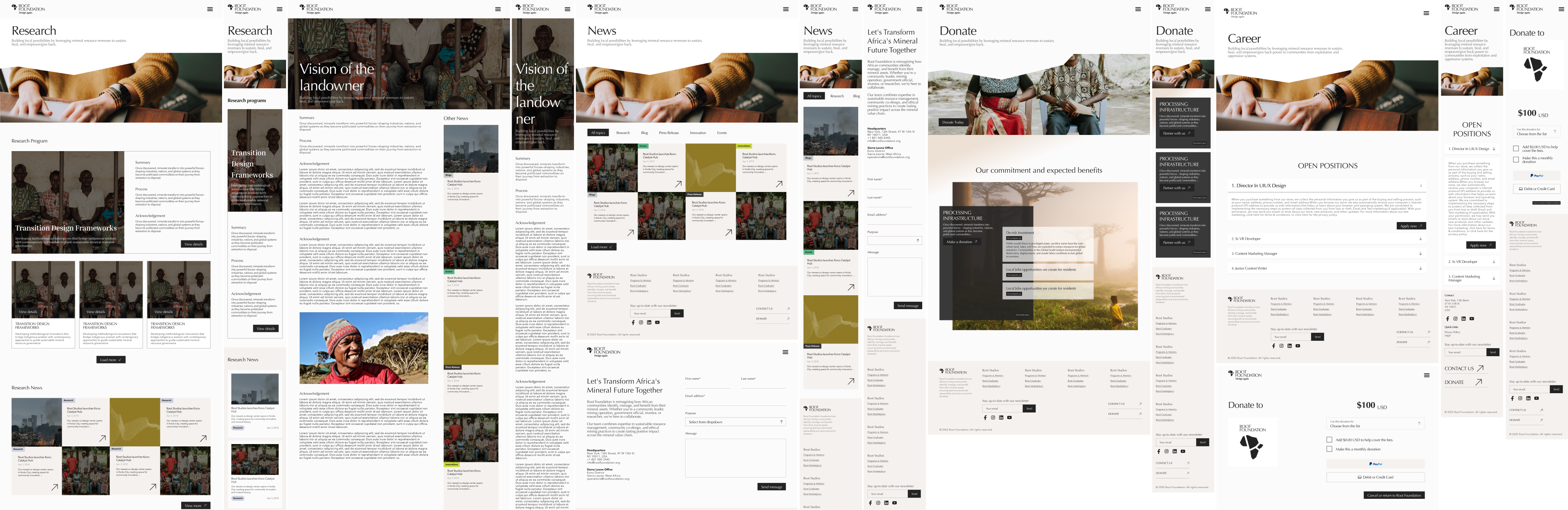
As founding and solo product designer, led web and mobile-web design for three platforms (Root Foundation, Root Studio and Root Diamonds), working directly with the founder and engineers from concept to high-fidelity prototype.
Turned dense, multi-stakeholder mineral research into an interactive data dashboard, iterating on interaction models and user pathways.
Designed the Root Diamonds shopping and checkout journey around miner stories, diamond origin and transparent price breakdowns.
Prototypes and product vision helped Root Foundation secure multi-sector funding.
Root Foundation is a mineral-focused organization committed to driving long-term sustainable returns to Africa by strengthening the continent’s mineral endowment. Working directly with founder Fas Lebbie, I designed a digital platform that brings his research on Africa’s mineral production cycle to life and proposes a new, more transparent model for connecting buyers with local miners.
Ultimately, the website and design system strengthened Root Foundation’s ability to communicate its mission, showcase research, and present a credible, future-ready vision for sustainable mineral trade in Africa.
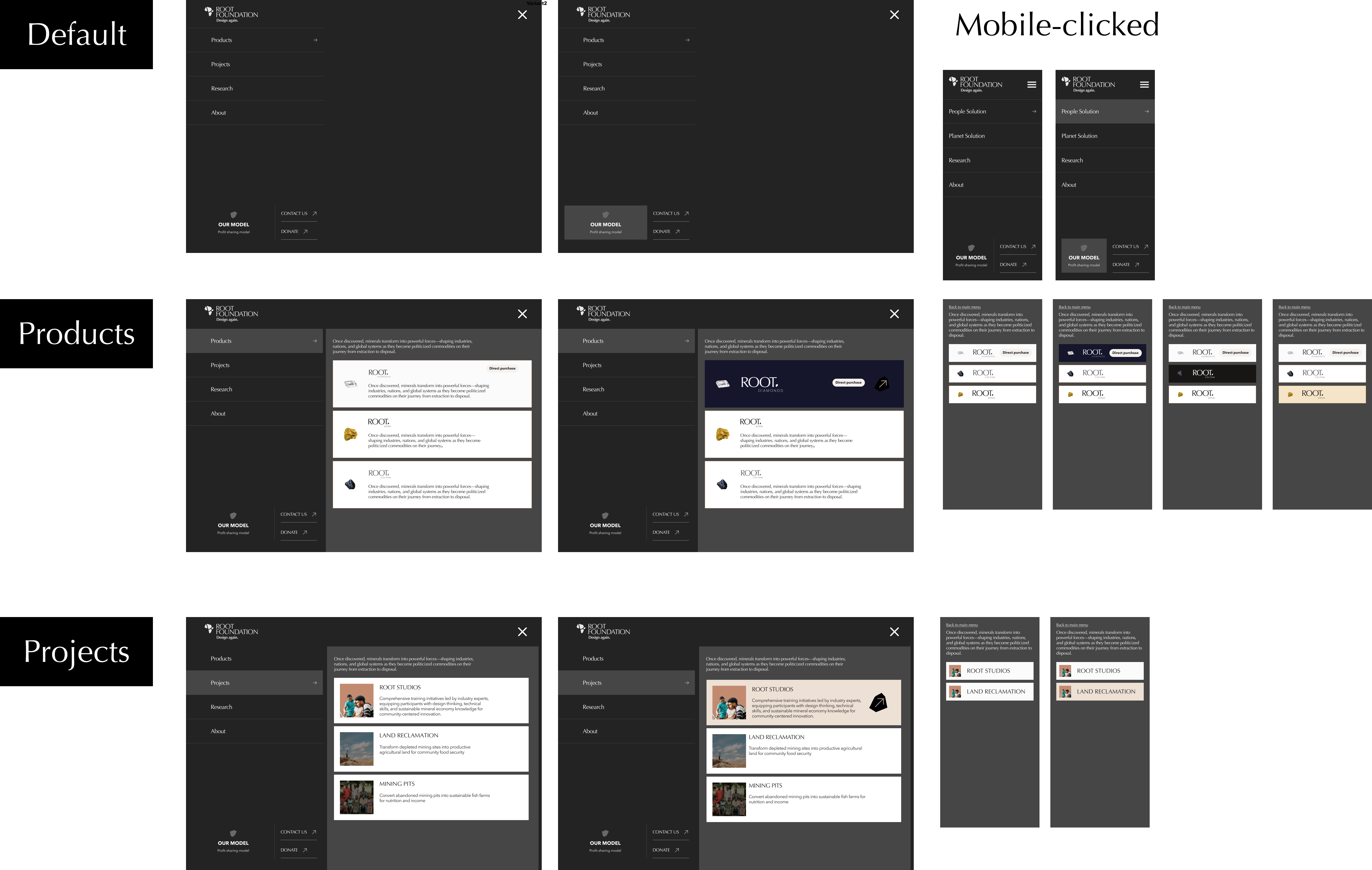
Immersive Full-Screen Menu (Overlay Navigation) or On-Screen Menu?
While on-screen menu is more common and easier for navigation with less click, however We decided to offer space to provide descriptive context for each service segment and use visual cues and hierachical structured to create a more guided exploration experience.
The website was designed with a clear and intuitive structure that connects users to all Root Foundation initiatives under one unified umbrella.
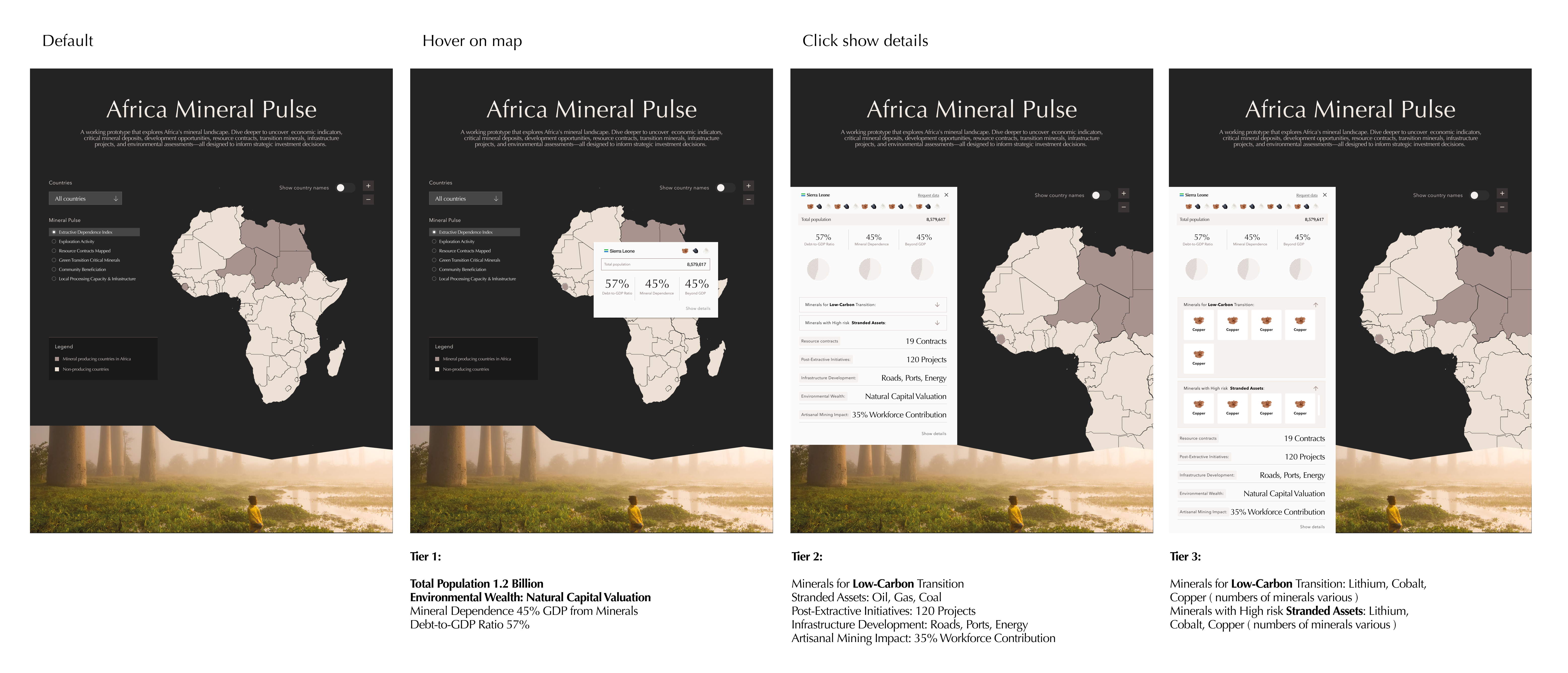
The homepage needed to function as the central entry point to Root Foundation’s knowledge ecosystem. One of the most demanding challenges was designing an interactive data dashboard capable of presenting rich, complex research on Africa’s mineral production cycle.
How can we design an interactive dashboard that delivers rich information in a way that is digestible, intuitive, and engaging?
I began by studying the dataset closely, exploring different ways to segment and group the information, and aligning with the founder on the core message the dashboard needed to communicate, helping users grasp the severity and context of the issue at a glance.
Then I exploring a range of interaction possibilities such as hover previews, direct clicks, and filter controls to understand how different patterns could shape user flow and cognitive load.
From there, I mapped every possible user pathway to ensure clarity and cohesion, considering what users see first, how they move between levels of detail, and how each interaction affects context and navigation.
With these pathways defined, I refined the interface for smooth, continuous interaction, designing clear visual states, consistent tooltips and filters, and seamless transitions.
This approach resulted in an interactive dashboard that feels intuitive, predictable, and engaging without overwhelming the user.
Root Diamonds, one of the foundation’s most important local initiatives, was designed as a digital storefront that reimagines how diamonds and minerals are sold.
How to transform the marketplace into a relational, community-centered platform?
Instead of treating diamonds as luxury merchandise, the platform highlights
This approach not only humanizes the purchase experience but also supports Root Foundation’s mission of reinforcing healthy cash flow back into the communities where the minerals originate.
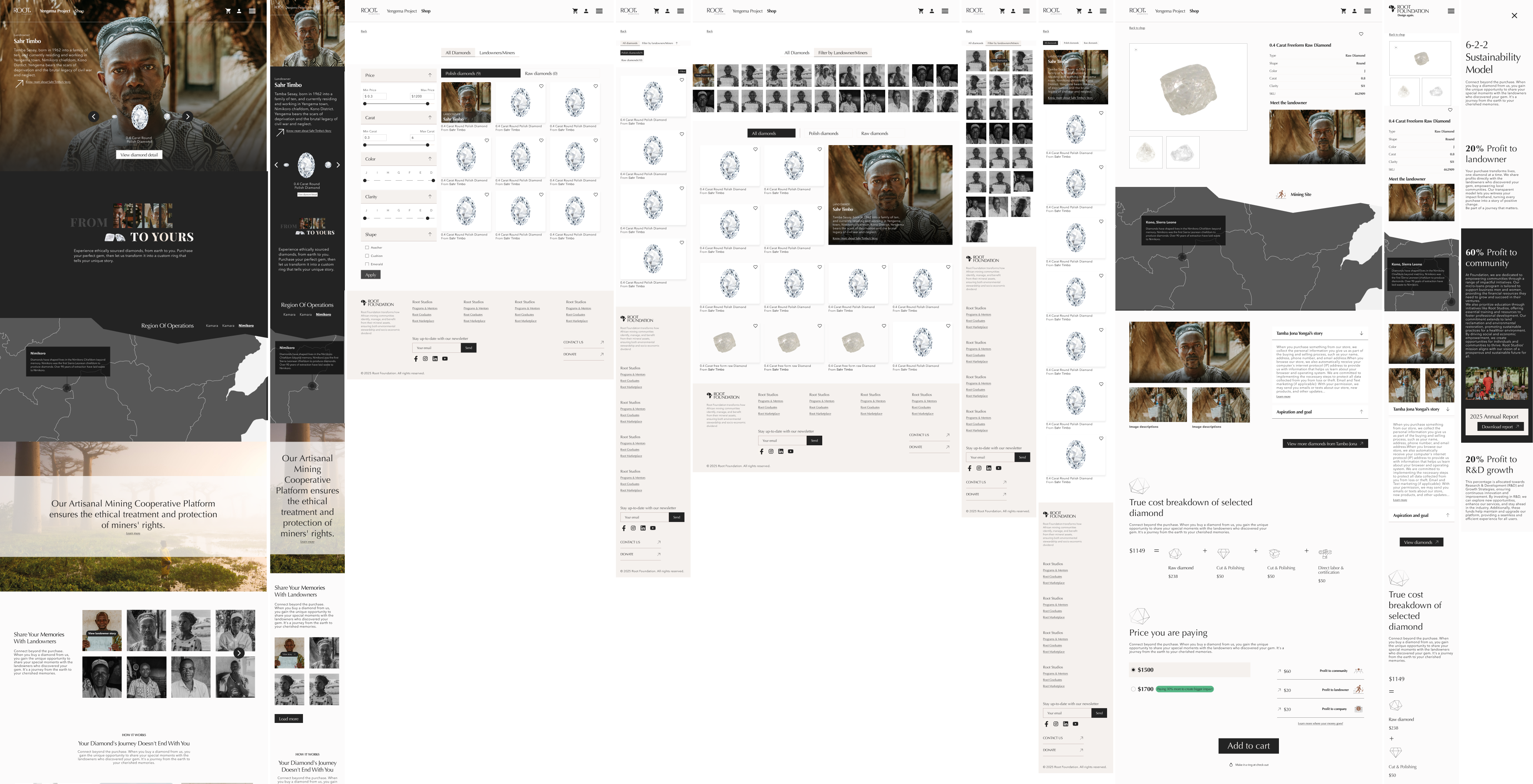
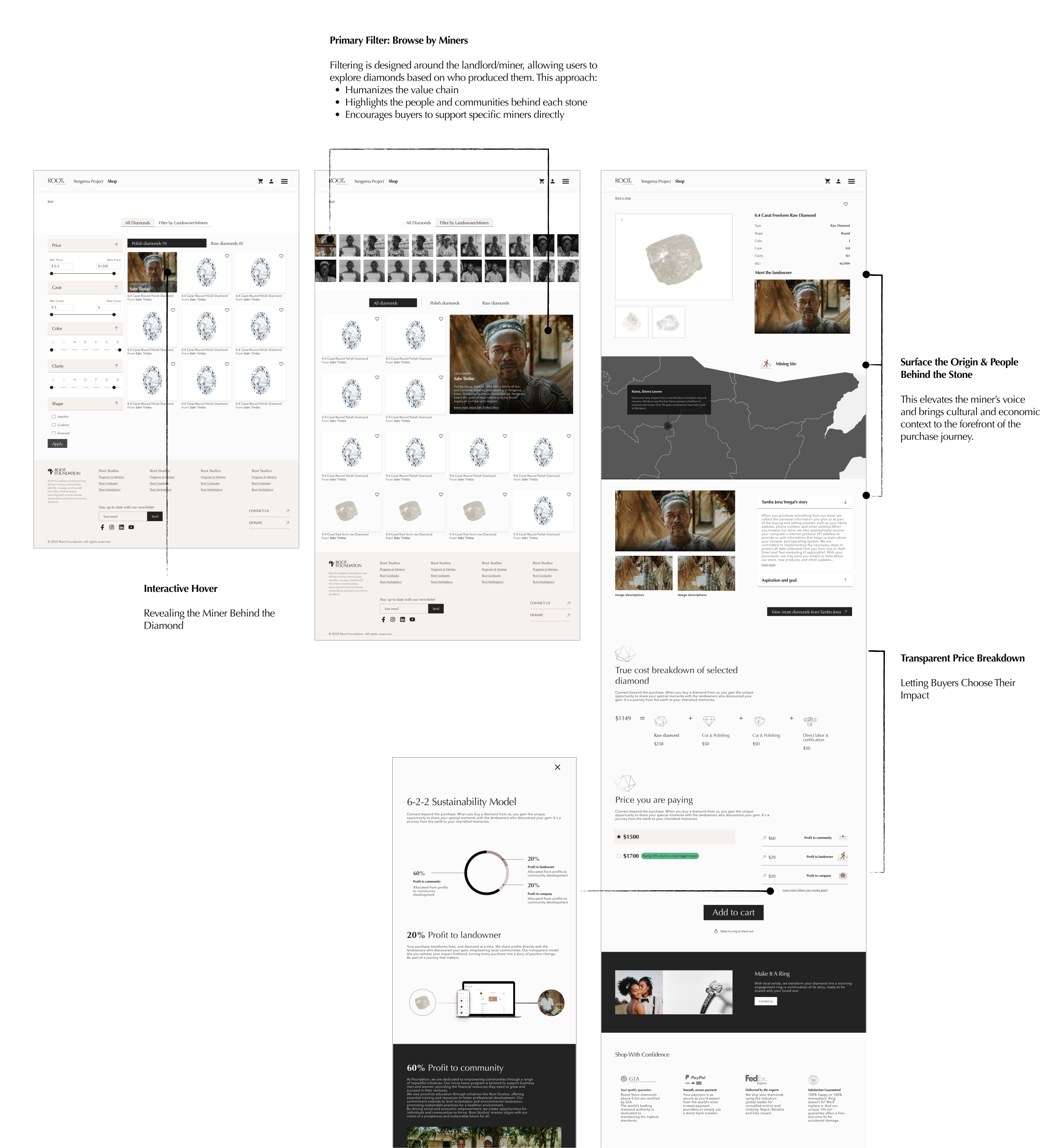

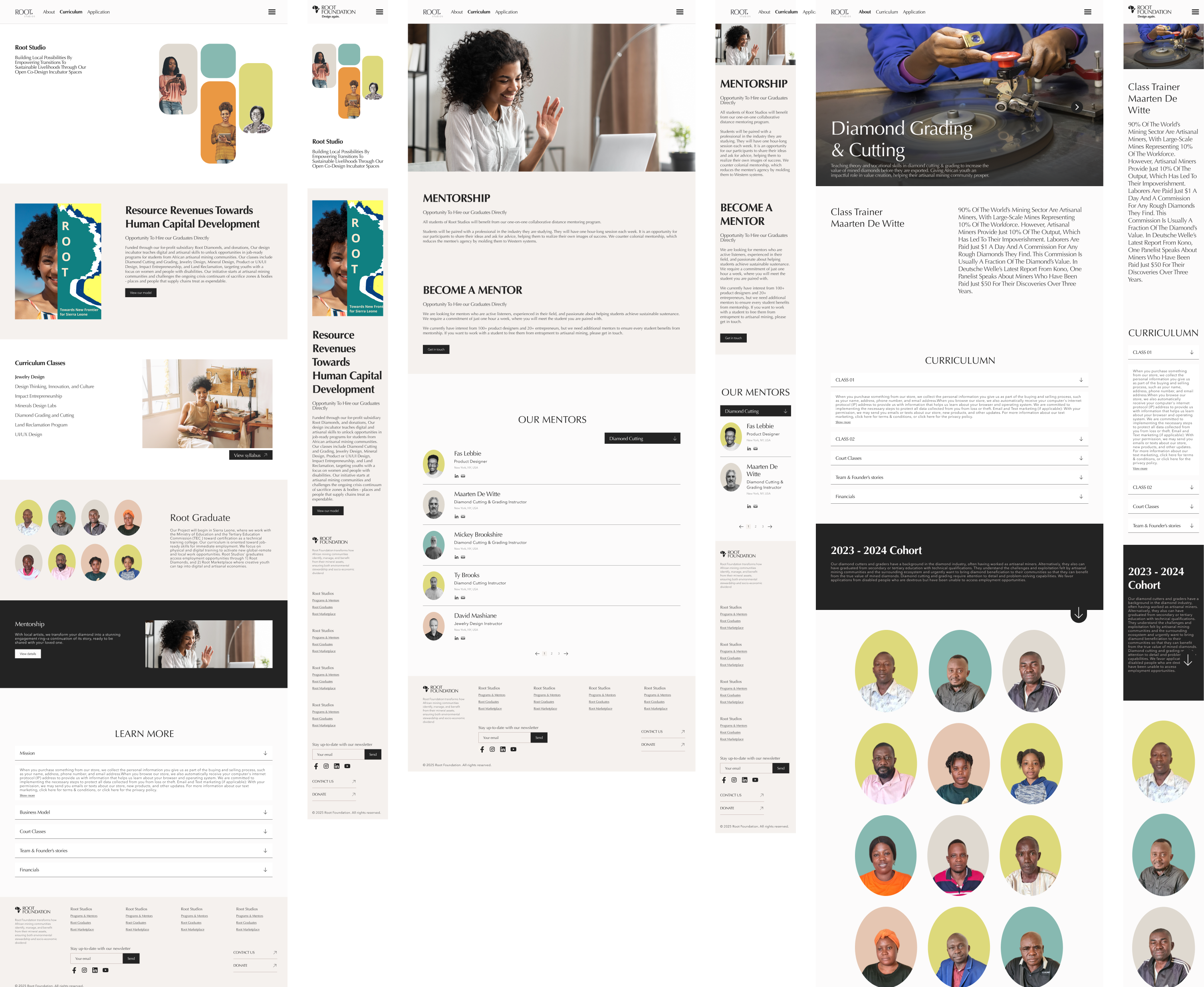
Designing Root Diamonds required balancing familiar industry patterns with the foundation’s mission. While I referenced marketplaces like Blue Nile and Tiffany to understand standard shopping behaviors, their product-first approach didn’t align with our goal of highlighting miners and community impact. This challenge pushed me to think creatively about blending both worlds—keeping essential filters like carat and clarity for usability, while designing interactions that constantly connect each diamond back to its origin and story. The result is an experience that feels both practical and purpose-driven, proving that creativity often comes from rethinking familiar patterns through a new lens.
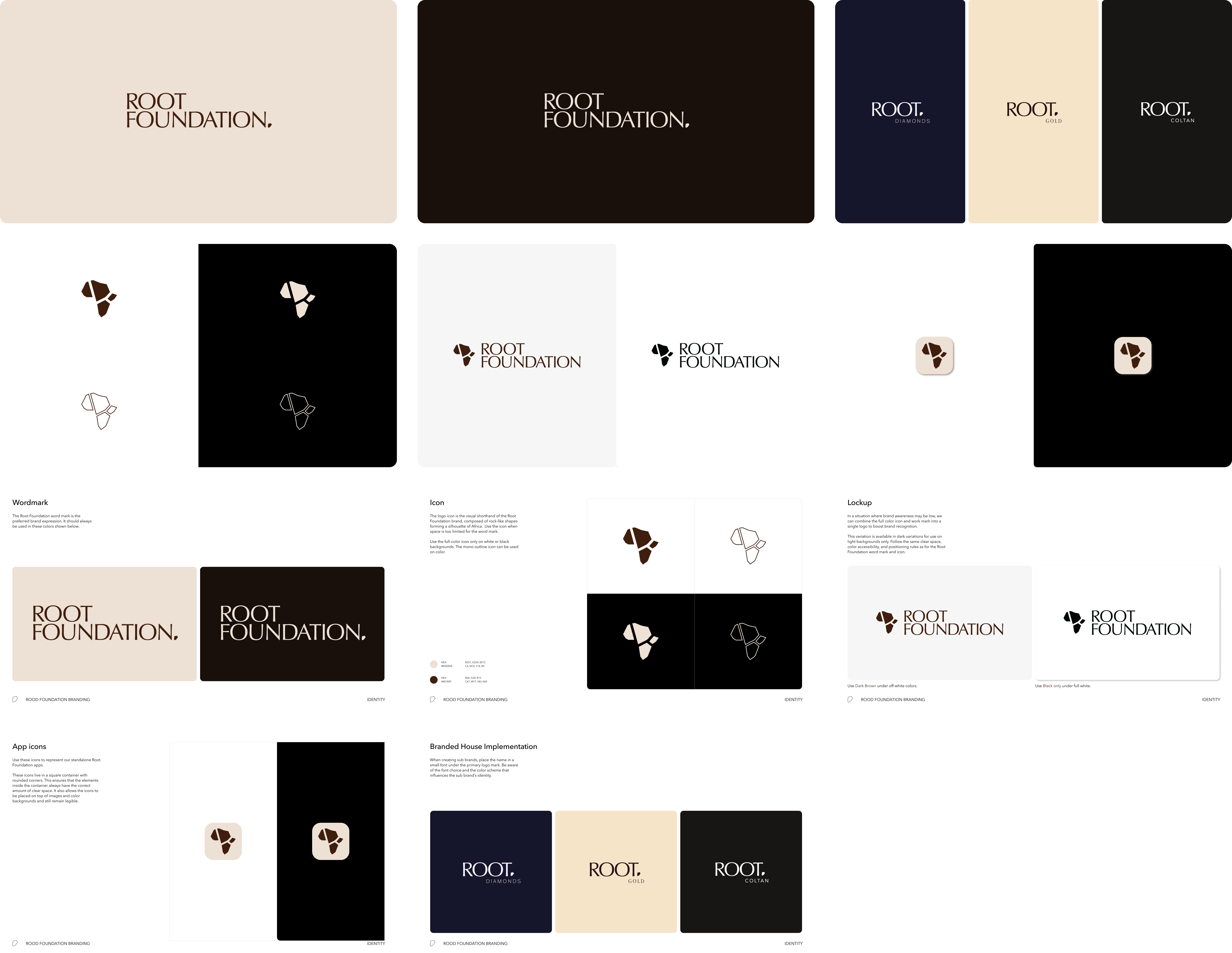
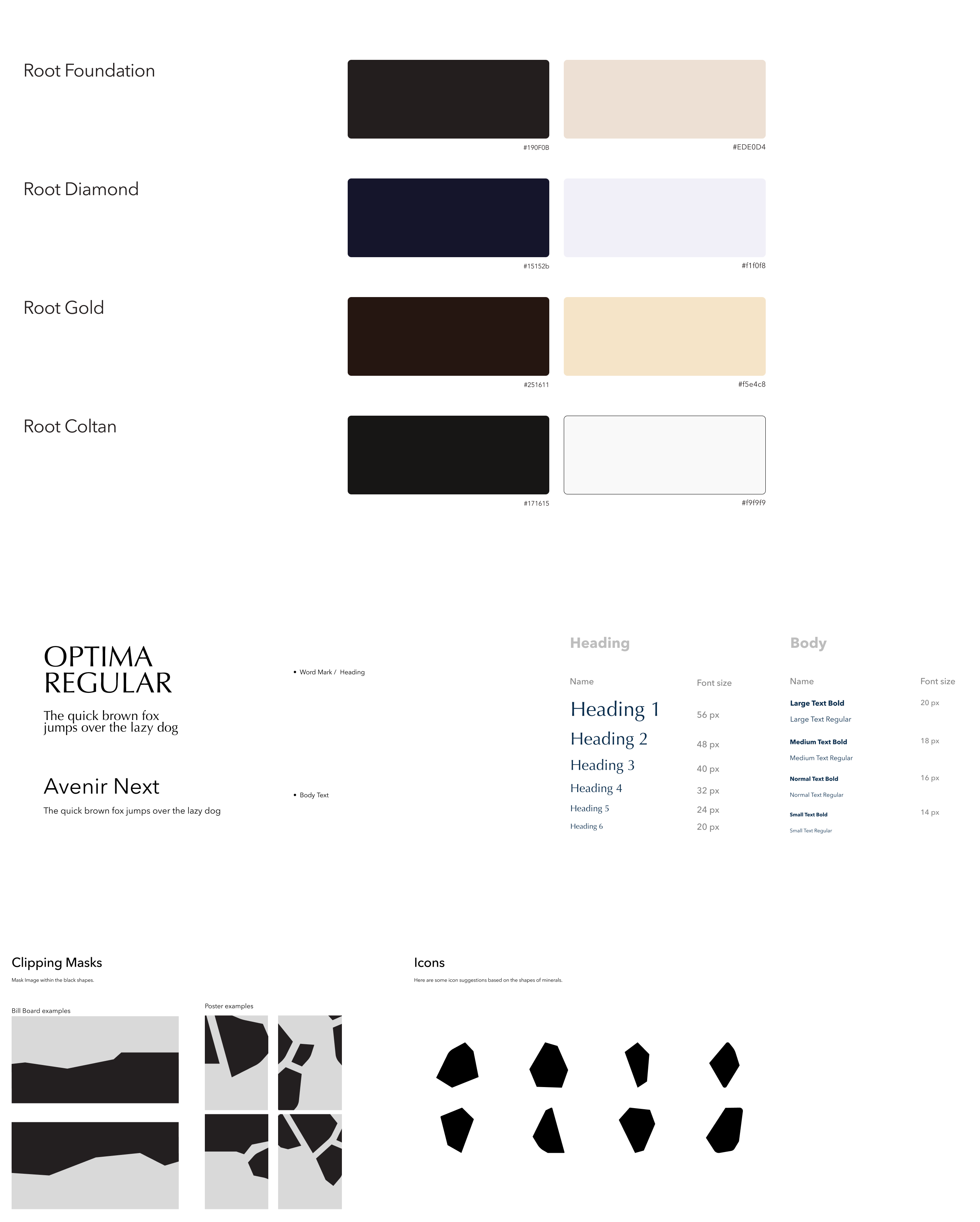
Cohesion and consistency were essential to achieving a high-quality visual design backed by a strong design system. I went through multiple iterations before reaching the final direction, reusing components and creating variations that all spoke the same visual language. This ensured the entire experience felt unified, scalable, and thoughtfully crafted.
If I have more time, i would deepen the design system to cover additional edge cases. Moreover, conducting user testings for key flows, such as interactive dashboard, diamonds purchasing flow, to validate assumptions.


A Product Designer
based in Washington DC-Baltimore Area


